This is a collection of stand-alone Python-based graphical utilities for plotting the output of GENESIS 2 and GENESIS 3 (G-3) simulations. The simulations use the asc_file object to write simulation variables to a file, with one line per step of the output clock. These scripts may also be useful as prototypes of graphical objects that could be more directly incorporated into the GENESIS 3 GUI, or with other simulators. Although some of the utilities are specialized for output generated from the 'ACnet-2' layer 4 auditory cortex model, they are designed to be easily 'hacked' for other uses and other simulators.
All of these scripts make use of the powerful scientific graphics capability of Matplotlib, which easily generates a wide variety of plots, accompanied by a Navigation Toolbar that allows for panning and zooming of plots, and saving to publication quality PNG format images.
In order to run these scripts, you will need python version 2.5 or later, and the Matplotlib library for python, which can be downloaded from http://sourceforge.net/projects/matplotlib. The installation instructions explain other requirememts, such as NumPy (numerical libraries for python) that are usually installed along with python on most Linux systems.
The main script of this package, G3Plot.py also requires wxPython, the python implemention of the wxWidgets widget set used by GENESIS 3.
The use of these python libraries is described in the Frontiers in Neuroinformatics special issue on Python in Neuroscience at http://frontiersin.org/neuroscience/neuroinformatics/specialtopics/8/. More information and documentation for Matplotlib can be found at http://matplotlib.sourceforge.net/.
Here is a brief description of the scripts and their usage:
plotVm.py - A simple utility for ploting membrane potentials, that uses the Matplotlib object-oriented classes. It takes multiple wildcarded filenames as a argumments, and plots them in different colors on the same axes, e.g.:
plotVm.py Vm.out pyr4*.out
It has labels and scales specific for membrane potenntial plots, and is handy for quickly comparing the results of current injection simulations. The (x,y) coordinates of a point on the graph can be displayed in the Navigation Toolbat by positioning the cursor over it.
gipyplot.py - A much improved and more general version of plotVm, that can overplot multi-column data from single or multiple files. It also has command line options, including '-h' for help. More details are given in the file README-gipyplot.html.
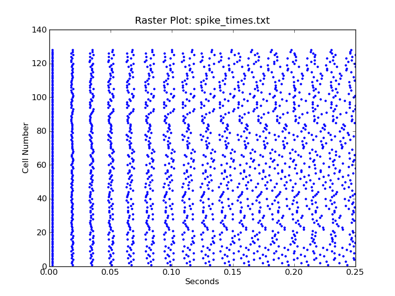
rasterplot.py - Similar to plotVm, but specialized for creating raster plots of firing times for a group of neurons. It takes a single filename as argument, with a line for each cell containing the spike times separated by spaces. The times are plotted as dots with the time on the x-axis and the cell number (the line number) on the y-axis.
The image rasterplot.png shows the plot generated with:
rasterplot.py spike_times.txt
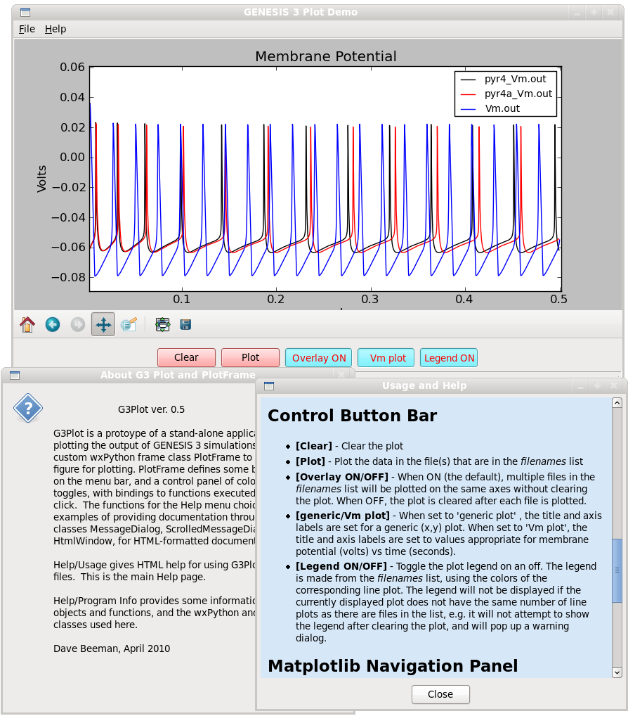
G3Plot.py - This is an enhanced version of plotVm that wraps Matplotlib plots within a wxPhython GUI. This has several fancy Help menu features and plotting options to illustrate (and for me to learn about) the capabilities of wxWidgets as a GUI for displaying simulation results in Python. It can either take the filename list as arguments, or to be entered in a dialog from the File/Open menu selection.
It addition to the usual Menu bar with File and Help menus, it has a Control Panel of colored buttons and toggles for clearing the plot, plotting, setting overlay ON or OFF, and toggling the Legend display. The Legend identifies each colored line on the graph with the filename in the same color.
The HTML Usage help describes the use of the Matplotlib Toolbar that is used in these programs, as well as Menu choices and Control Panel buttons. The Program Info scrolling message dialog gives information obtained from program documentation strings about the objects and functions, and the wxPython and matplotlib classes that are used here.
The image G3Plot-demo.png shows a screen dump of the GUI with Usage and About help displayed with the plot produced by:
G3Plot.py pyr4*.out Vm.out
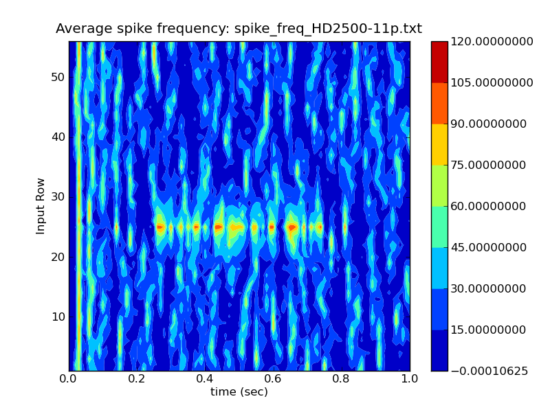
rowrateplot.py - This is a utility for analyzing network activity by displaying a filled contour map of spike frequency vs. simulation time for groups of neurons. It takes a single filename as argument. The first line is a header with the total number of lines in file (nlines) and number of values/line (ncols). The remaining lines contain data, with a line for each time step containing the simulation time, followed by the average spike frequency (firing rate) during that time step for each group of cells. Typically each cell group is a horizontal row of cells in the network that are receiving auditory input. Time is plotted on the x-axis, cell group (row) on the y-axis, with the average firing frequency of cells in that row at that time represented by a colored filled contour plot.
The image freqplot-HD2500-11p.png shows the contour plot generated from:
rowrateplot.py spike_freq_HD2500-11p.txt
The data file was produced from asc_file output of an early version of the GENESIS 2 layer 4 auditory cortex simulation 'ACnet2'. The parameters used for the connection weights in this run provided strong response to the random background input, and to a 220 Hz tone pulse with thalamic input to row 25 and nearby rows, lasting from 0.25 to 0.75 seconds. rowrateplot.py has been useful for tuning parameters to balance excitation and inhibition.
netview.py (G-3 Network View 1.7) - a stand-alone Python application for viewing the output of GENESIS 2 and 3 network simulations. It is intended to replace GENESIS 2 SLI scripts that use the XODUS 'xview' widget. The image created with Netview is an animated representation of a rectangular network with colored squares used to indicate the value of some variable at that position and time. Typically, this would be the membrane potenial of a cell soma, or a synaptic current in a dendrite segment. The Help menu 'Usage and Help' selection provides a pop-up window telling you how to use the program and describing the format of the data files. Note that files compressed with bzip2 can be read with netview, making data storage very efficient.
netview-I.py - a slightly hacked version of netview.py that has a color scale adjustment for EPSC data that contains a few very large synaptic current values at the beginning of the file.
plotPSD.py and plotPSD0.py are very simple scripts that use the Matplotlib 'psd' module to calculate the Power Spectral Density (PSD) of time series data. These 'hackable' scripts were written for analyzing the summed Excitatory Post Synaptic Current (EPSC) from all the cells in a network, but can be used for any data with a pair of (t, x) values per line. Also note from the Python code, that the PSD is calculated from four overlapping windows into the length of the data. They take a single file or wildcard list of files as arguments.
A typical usage would be:
$ plotPSD.py EPSC_sum_M0005*
Plottting average of  4 runs from series  M0005
EPSC_sum_M0005B.txt EPSC_sum_M0005D.txt EPSC_sum_M0005E.txt EPSC_sum_M0005.txt
plotPSD.py averages the PSD from all the files, and would be used when the files in the example above are different runs with different random initial conditions, to be combined. plotPSD0.py is similar, but it overplots the spectra on the same graph. This is used when comparing runs that have different parameters or different models.
weight_hist.py plots a histogram of synaptic weight values for the connections to a synaptically activated channel, such as a GENESIS synchan element. The data is typically generated from a simulation that modifies synaptic weights, using a GENESIS object such as 'stdp_rules'.
Usage: weight_hist.py filenames [filenames2] [filenames3] ...
The 'filenames' argument is a wildcarded list of filenames, e.g. weight_hist W128ex32inh-gmax0.2*.txt, or a single filename. Each file should consist of a single line of synaptic weight values. If there is more than one file, the data are plotted as separately colored and labeled bars. The script could easily be modified for plotting histograms for other types of data.
A set of wxPython 'widgets' has been developed to mimic the appearance of the basic GENESIS 2 XODUS widget set. This makes it possible to build similar GUIs for simulations in G-3 or other simulators.
The tutorial Creating a G-3 GUI with Python contains the Python code for the widgets, and describes how to add a graphical environment to a Python G-3 simulation, similar to the GENESIS 2.3 XODUS version.
Under Fedora 12 Linux, the scripts plotVm.py and rasterplot.py produce the warning message:
/usr/lib64/python2.6/site-packages/matplotlib/backends/backend_gtk.py:621: DeprecationWarning: Use the new widget gtk.Tooltip self.tooltips = gtk.Tooltips()
G3Plot.py does not produce this warning, but does not show the (x,y) coordinates of the cursor in the Navigation Toolbar. This is a very handy feature of plotVm.py, when measuring action potential times and amplitudes.
Note that G3Plot uses the Matplotlib backend API for embedding in wxPython, matplotlib.backends.backend_wxagg NavigationToolbar2WxAgg. The other scripts, which do not use wxPython, use matplotlib.pyplot.figure, which has the Toolbar built in. Possibly, there is a setting to enable this feature hidden somewhere in NavigationToolbar2WxAgg.
Dave Beeman Tue Jul 8 16:35:40 MDT 2014